I attended a conference last spring, given by an organization who shall remain nameless because of what I am about to tell you. It was actually a good conference, filled with useful info that I was able to bring back and apply to my daily work. But what I also brought back was one hideous-looking Certificate of Completion.
I put it up on my wall anyway because I was proud of my accomplishment. But, within moments, one of my coworkers commented on it (quite possibly how that word hideous got planted in my brain). It was shoddily laid out and seemed to just scream that it had been thrown together both quickly and carelessly. Exactly not what a certificate is supposed to portray.
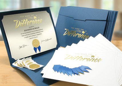
The thing about certificates is that they are meant to be shown off. Which means they should probably look nice. Not just nice, actually, but impressive. And if you’re going to the trouble of giving an award, it should represent the achievement accordingly.
This is not at all hard to do.
1. Start with the paper. Ask yourself: is this a formal or casual occasion? Can I use a preprinted sentiment, or is the award specific enough that it needs to be customized?
Our blank and pre-printed papers run the spectrum from elegant and distinguished to fun and informal. Really, if you can’t find it here, it probably doesn’t exist!
Bestselling Scallop Completion Bright-Foil Field Day